Ecommerce Website Examples to Inspire You in 2023
27 ecommerce website examples to inspire your design
If you’re looking for inspiration for your website, check out these 27 ecommerce website design examples to get some ideas for your site!
Table of Contents
- Spotify
- Apple
- Lush
- Warby Parker
- Mahabis
- Grovermade
- Chewy
- The Soap Co.
- Dainty Jewells
- Bliss
- Crossrope
- Decibullz
- Adidas
- Fronk
- UNTUCKit
- Bold & Noble
- Dollar Shave Club
- Kings Coast Coffee Company
- Pipcorn
- Factory 43
- Biolite
- Nike
- Zagg
- Lovepop
- Birchbox
- Lego
- Rebecca Atwood
- 5 Common characteristics of these great website examples
1.Spotify
First on our list of examples of ecommerce websites is Spotify. Spotify’s design is simple and visually appealing. They use a clean black and white theme with colorful images to catch users’ attention.
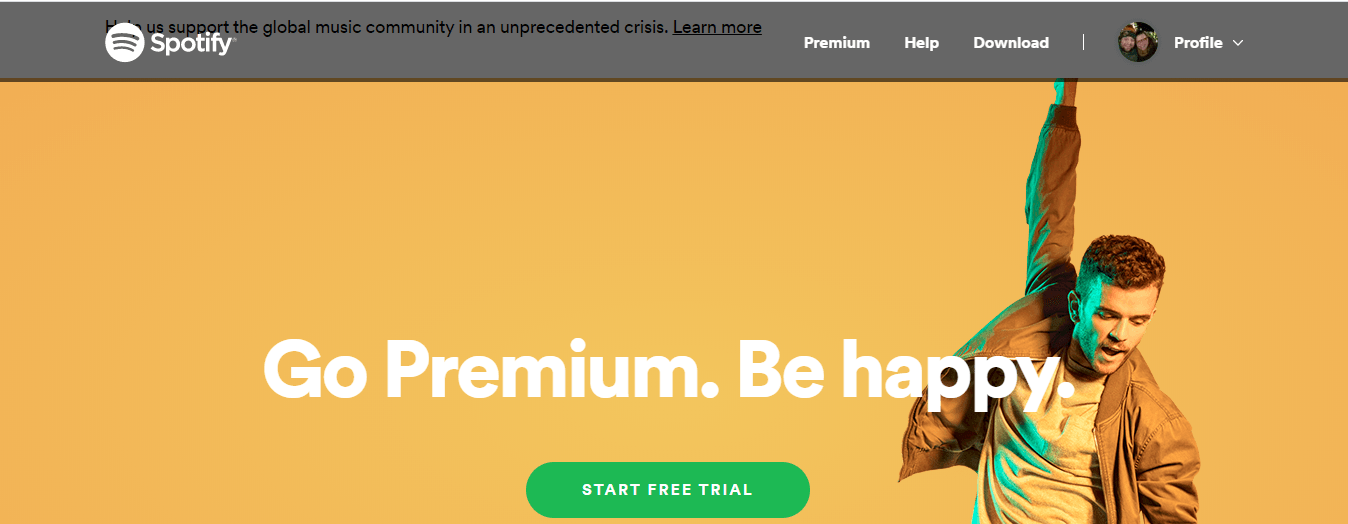
Additionally, Spotify uses a bright greencall to action (CTA) buttonthat pops off the page and draws users’ eyes. This design is simplistic and easy for users to digest.
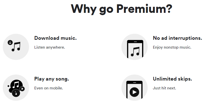
On Spotify’s premium page, you’ll see icons in their section “Why go Premium.” These icons are visually appealing and break down the benefits of Spotify premium in a way that’s easy to follow.
Overall, Spotify is one of the best simplistic and functional ecommerce site examples.
2.Apple
If you’re looking for ecommerce website design examples that showcase clean and modern design, Apple’s website is at the top of that list. Apple’s utilizes a black and light gray theme throughout their site to give it a classic feel.
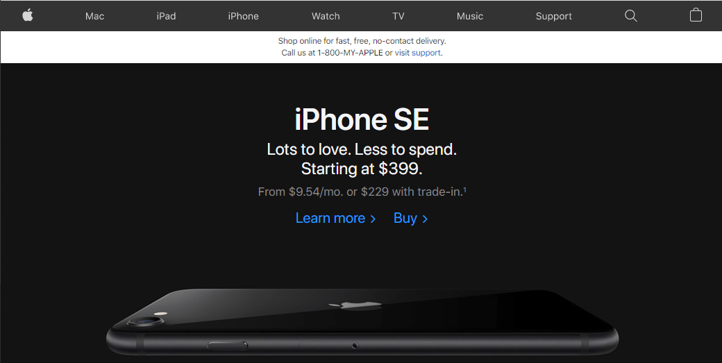
Apple also has a clean andeasy-to-use navigation.

Users can easily select the product they’re interested in — from Macs to Apple Watches. When you select a product, you’ll see that Apple isn’t afraid to use white space — which is one of the elements that makes their website feel clean and tidy.

Overall, Apple’s clean design makes it easy for users to browse through their products and find what interests them most. The modern design is visually appealing, which draws users in and gets them to engage on the page.
3.Lush
Next on our list of examples of ecommerce websites is Lush. This popular cosmetics store is known for their handmade products, including bath bombs, body butters, and lip gloss. But what makes Lush’s website good enough to make it on our list of ecommerce website examples?
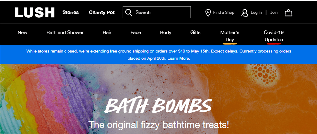
Just like Apple and Spotify, Lush’s website opts for a contemporary and simplistic black and white website design. This model allows the photos of their colorful products to stand out on the page.
Additionally, Lush’s clean and simple navigation makes it easy for users to find the products they want.
Lush also uses icons and applies their distinctive font to highlight theunique selling points (USPs)of their products, like being cruelty-free and 100% vegetarian.

Overall, Lush’s site features a clean design that’s easy to navigate.
4.Warby Parker
If you want to get inspiration for your ecommerce web design, check out Warby Parker! This eyewear company has a simple web design that employs whitespace to keep users focused on their glasses.
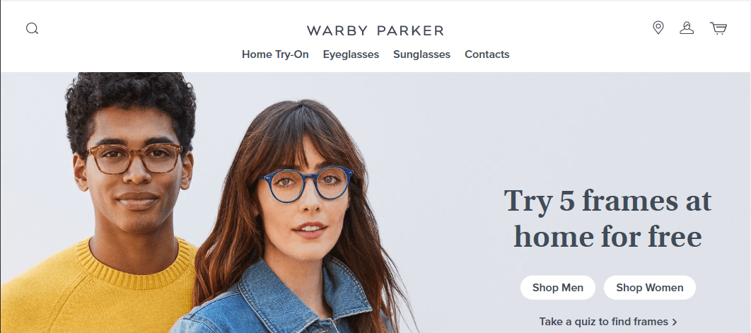
Their ecommerce website has simple navigation that makes it easy for users to find the products they need, like eyeglasses and sunglasses.
Additionally, Warby Parker prominently displays their top selling feature — they offer at-home try-on so customers can try the frames before they buy.
Warby Parker also offers a greatuser experienceon their site. They have features like the frames quiz, which allows users to find the best frames for them after answering a few questions. This quiz fits into Warby Parker’s design aesthetic and provides anexcellent experience for userson their page.

This eye-glasses company is an excellent example of creating a clean and user-friendly website for ecommerce.
5.Mahabis
Mahabis design is intuitive and interactive, which is why it’s next on our list of ecommerce site examples. This shoe store provides fun and interactive ways for users to engage with and learn about their products.
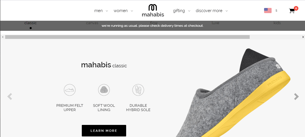
As you scroll down their homepage, you’ll get a breakdown of Mahabis’s shoes and how they’re made. Thisinteractive graphiccatches the users’ attention and engages them on the page — boosting key site metrics like time on page and decreasing metrics likebounce rate.

Additionally, Mahabis uses dozens of visuals on their site to showcase their products. It’s undoubtedly an eye-catching site that engages users while guiding them down the marketing funnel.
6.Grovemade
Grovemade is a company that makes desk accessories, as well as tools like iPhone cases and pocketknives. Their products have a modern aesthetic, and their website matches their style.
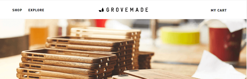
This website is one of our favorite examples of ecommerce web design because, like many of our other ecommerce website examples, it utilizes whitespace throughout the site. The whitespace on Grovemade’s site makes it easy to browse through their products and prevents users from becoming overwhelmed with information.
Grovemade also integrates features like image carousels, where users can see featured products.
Additionally, Grovemade’sabout pagetakes their style to a new level. When you hover over their team members, you get to see a fun photo of that staff member. It’s an entertaining web design element that creates an interactive and playful feeling for visitors.

7.Chewy
Next on our list of ecommerce website examples is Chewy. This pet supply website provides a great example of integrating your brand’s unique color scheme into the site. Chewy has a defined blue and yellow color scheme that you’ll see throughout their site in various ways.
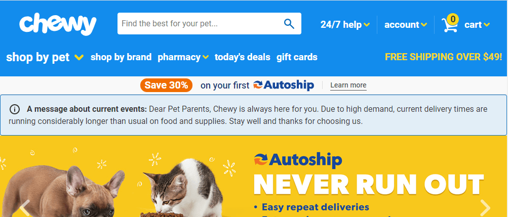
除了强大的配色方案,也难嚼的has an organized site navigation. This is crucial for ecommerce websites that offer a wide range of products — especially if you want to provide users with the best possible experience.
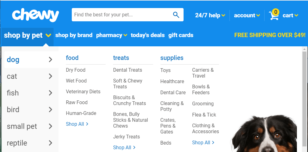
Chewy makes it easy for pet owners to shop based on the pet they own. Once they choose their pet category, the navigation is broken down even farther by food, treats, and supplies. This navigation format makes it simple and easy for visitors to find the products they need.
8.The Soap Co.
The Soap Co., a company that makes natural soaps, is another one on our list of ecommerce site examples. This web design is visually appealing and features a design that’s stylish, clean, and fits the company’s unique style.
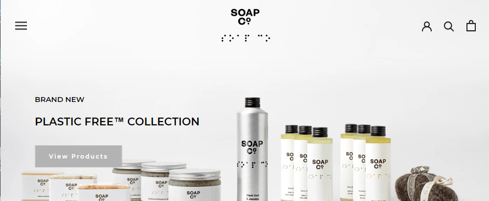
The Soap Co. has small nuances that make the site visually appealing and engaging for visitors. For example, when you hover over the photos that outline the company’s USPs, the images move slightly, keeping users engaged.

Small design elements like these can have a significant impact on your audiences’ engagement on your site — leading to a higher dwell time and lower bounce rate.
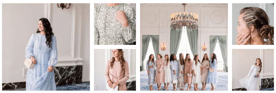
9.Dainty Jewells
Dainty Jewells is a women’s clothing store that portrays elegance in their web design — making it a great example of building brand familiarity. This clothing store integrates their brand’s simple peach and white design throughout their website.
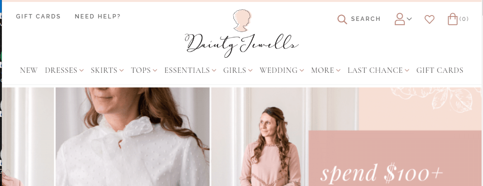
As you browse through their site, you’ll find that they use many photos to show off their products. Not only are their images extremely high-quality, but the photos are shot in a scene that fits with the brand’s aesthetic.
像许多不her sites we’ve discussed, Dainty Jewells uses icons to draw the user’s eye towards their benefits and special offers.
![]()
Overall, Dainty Jewells does a great job of integrating their elegant, girly style throughout the website, which is critical for building brand recognition, and ultimately, making sales.
10.Bliss
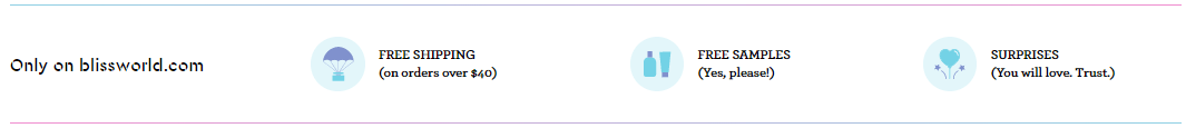
Next on our list of examples of ecommerce websites is Bliss. Bliss, a skincare company, has a visually appealing site that integrates their brand’s style throughout. Their multi-color, pastel design allows their brightly colored products to pop off the page.
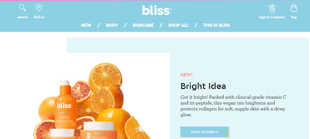
Another great part of Bliss’s design is the USPs they feature on their homepage. As users scroll down their page, they’ll come across icons that highlight Bliss’s best selling points.
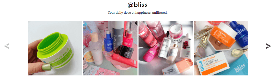
Additionally, Bliss integrated a carousel ofuser-generated contentinto their site. Not only do these photos fit the brand’s aesthetic, but they provide their visitors with a first-hand account of how their customers enjoy their products.
11.Crossrope
Crossrope is another great ecommerce site example that uses a sleek design that integrates user-friendly elements to engage their audience. They integrate a light green and black color scheme throughout the site.
As soon as you visit Crossrope’s site, you’re greeted by a video that shows a couple using their products. This element helps catch users’ attention immediately and showcase the product to their audience.

As you scroll further down the page, you’ll find moving graphics of the merchandise that highlight the product’s features. This design feature is eye-catching and draws users into the page to learn more about the product.

Overall, Crossrope is an excellent example of ecommerce web design that focuses on creating a memorable, eye-catching experience that draws users in and gets them to engage with the site.
12.Decibullz
Decibullz is a custom earplug manufacturing company that integrates high-quality visuals and contemporary design to attract users. This company uses these visuals on their site to build user trust and create an aesthetically pleasing design.
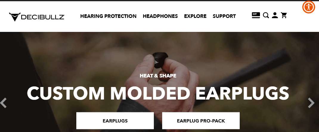
Additionally, Decibullz uses icons that visitors can hover over to learn more about the product. They’ll find information about the process for molding the earplugs and more info about how the earplugs work.
![]()
This website is a great ecommerce web design example that showcases how you can use visuals to highlight your products throughout your site.
Tired? Don’t Worry
We’ll send you the rest of the content with this guide
13.Adidas
Next on our list of ecommerce website examples is Adidas. Like other websites, Adidas integrates their brand’s black and white color scheme throughout their site.
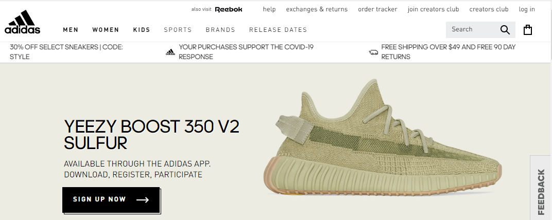
The unique feature to take note of from Adidas’s site is on their product pages. When you hover over a product of interest, you can preview the different available color choices for that shoe or piece of clothing. When people shop, they often want to see the color options for a product. Instead of having to click on the listing to see the color options, Adidas makes it easy for users to see the available options to see if that product fits their needs.

This element provides a user-friendly experience and makes it easy for visitors to shop on Adidas’s site.
14.Fronks
If you’re looking for one of the most creative ecommerce website design examples, Fronks is it. This site is extremely simplistic, as it’s a small business that sells their milk through another platform, but the elements this company features on their site adds great visual appeal.
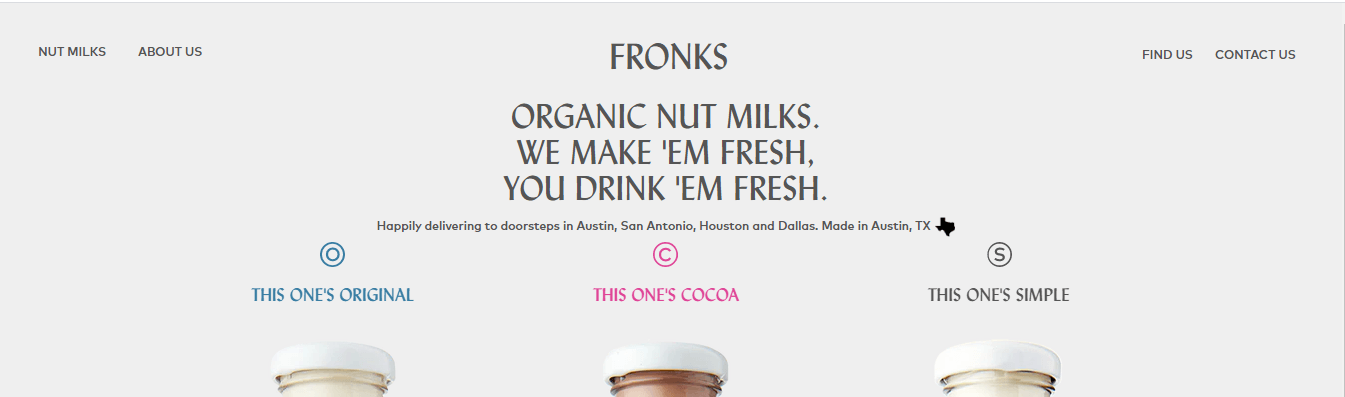
When you visit their product page, you can see the three types of milk they offer. As you scroll, one bottle replaces the next, making it a seamless transition to each product.

Unique elements like this one from Fronk’s site can help set your brand apart and help you create an engaging experience.
15.UNTUCKit
Like Fronks, UNTUCKit offers a visual element that enables users to see the value in their products and learn the difference between a UNTUCKit shirt and a regular shirt.
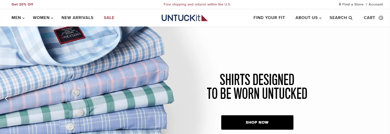
UNTUCKit prides itself on being a dress shirt company that offers shirts that look good untucked. To illustrate how much better their shirt is than regular dress shirts, they use a slider visual that allows users to compare the two types of shirts.

When you’re designing your ecommerce website, keep design elements like this in mind. It can be a pivotal element that helps you stand out from your competition and keep leads engaged on your site.
16.Bold & Noble
From photo prints to tea towels, Bold and Noble offers design-inspired elements that can spruce up any room. So, why is it on our list of ecommerce website examples? This ecommerce site is a great example of integrating a classy design to fit the brand’s style.
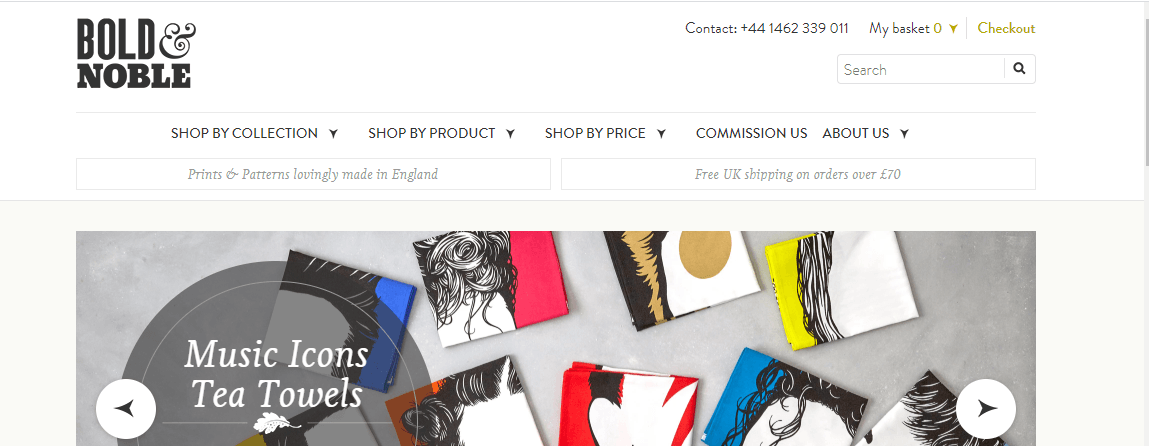
This website utilizes a chic, contemporary design that compliments their brand and product style. The design is basic, making it easy for users to browse through their site.
Additionally, if you’re looking to create a buying guide or explain how your sales process works, Bold & Nobile is a great place to turn for inspiration.

Their buying guide is visually appealing and makes it easy to find the relevant information customers need about the products, shipping, and product care.
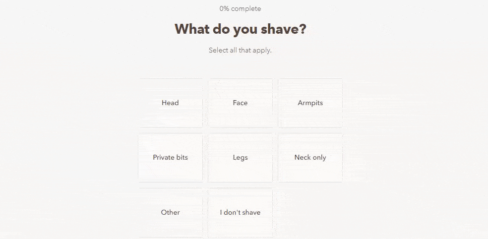
17.Dollar Shave Club
Next on our list of ecommerce site examples is Dollar Shave Club. This grooming company has numerousecommerce web design elementsthat make it a great inspiration for your website’s design.
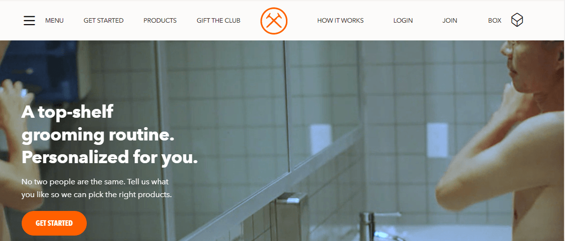
First, Dollar Shave Club is a prime example of how to make CTAs pop off your page. Dollar Shave Club’s orange CTAs are easy to spot on the page and immediately attract the user’s eye.
Additionally, Dollar Shave Club adds entertaining interactive elements on their site to boost user action, such as their quiz. These user-friendly design elements make it easy for their visitors to find the right products based on their needs.
18.Kings Coast Coffee Company
Next on our list of ecommerce website examples is Kings Coast Coffee Company. The coffee company uses innovative design to showcase their products.
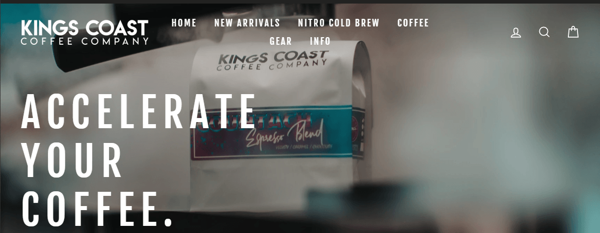
The important focal point for this ecommerce web design is their product listings. When you check out their products, you’ll find they’re neatly aligned and utilize white space to help users browse their coffee easily.
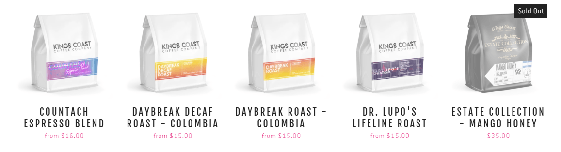
Additionally, they use “sold out” tags and gray overlays on products that are out of stock. This feature is great to add to your ecommerce design because it prevents people from clicking on your listing, just to see that it’s sold out.
19.Pipcorn
If you’re looking for ecommerce website design examples that take a fun approach, Pipcorn is at the top of the list. Pipcorn uses an exciting and colorful design that fits with their products and branding.
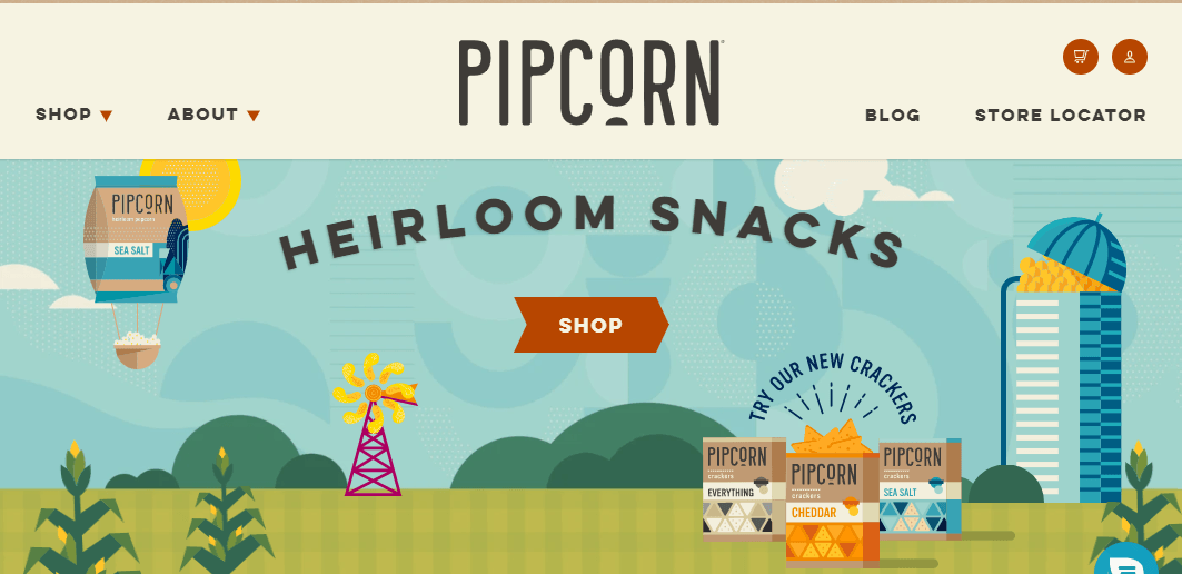
Additionally, Pipcorn adds little nuances to their site that make it more interesting. For example, when you hover over the products, they shake a little to catch your attention. It’s a small detail, but small details can help provide a better user experience for your audience.

20.Factory 43
As soon as you enter Factory 43’s website, you’re greeted with a striking graphic of robots working in a factory.

This website is a great example of how to carry your aesthetic throughout your site and match your website design with the look and feel of your products. As you scroll through Factory 43’s site, you’ll notice that all their images and graphics have the same style.

To have a successful ecommerce website, you need to carry your design consistently throughout your site and ensure it matches your brand. Factory 43 is a prime example of how you can do that for your ecommerce business.
21.BioLite
BioLite is next on the list of examples of ecommerce websites. This company sells fuel equipment for camping.
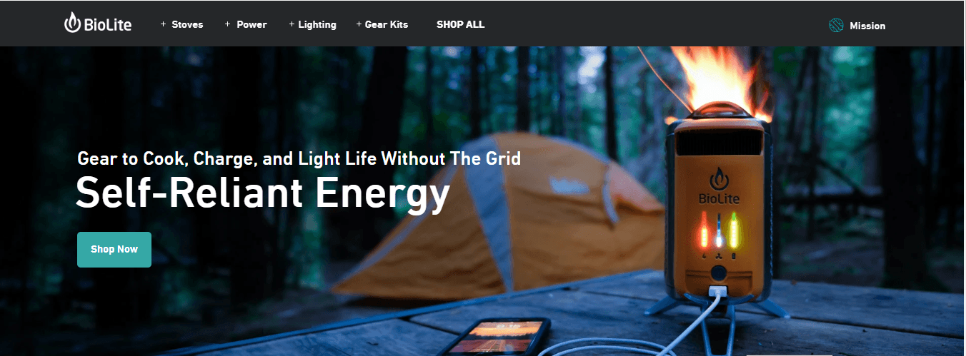
BioLite has many great design elements that you can use for inspiration on your site. For example, their navigation uses icons for each of their products, making it visually appealing and easy to see what category a product falls.

Additionally, BioLite uses CTAs that stand out on the page. The teal colored CTAs pop off the page from the black and white design. This splash of color catches their audience’s attention and gets them to click.
22.Nike
Next on our list of ecommerce site examples is Nike. Nike uses a cutting-edge design to showcase their products and make it easy for customers to browse through their selection.
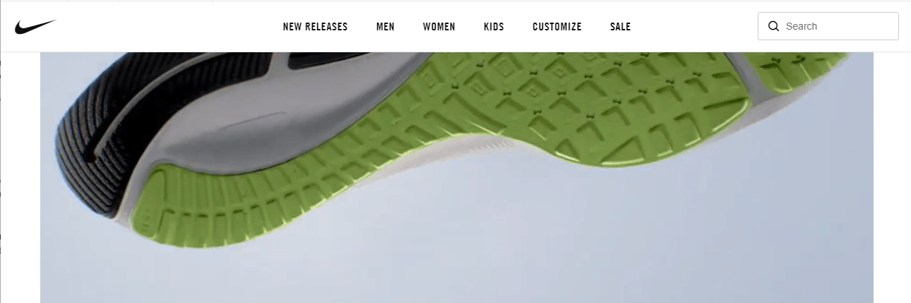
As soon as you enter Nike’s site, you’ll see a video highlighting their newest shoe. As you scroll down the page, you’ll see visuals of their products, people modeling their products, and more. They add features like carousels to encouraging browsing.

Additionally, Nike has an easy to use navigation so visitors can quickly and easily find the products they’re interested in buying.
23.Zagg
Zagg is a great example of creating a sharp website that uses white space effectively. This site also utilizes top-notch, colorful images to help highlight their different product offerings.
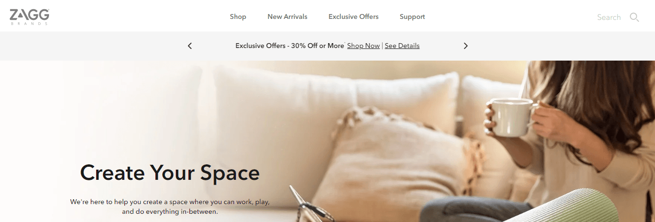
One of Zagg’s great web design features is that it enables users to shop for screen protectors based on their device. This feature utilizes icons to represent different devices.
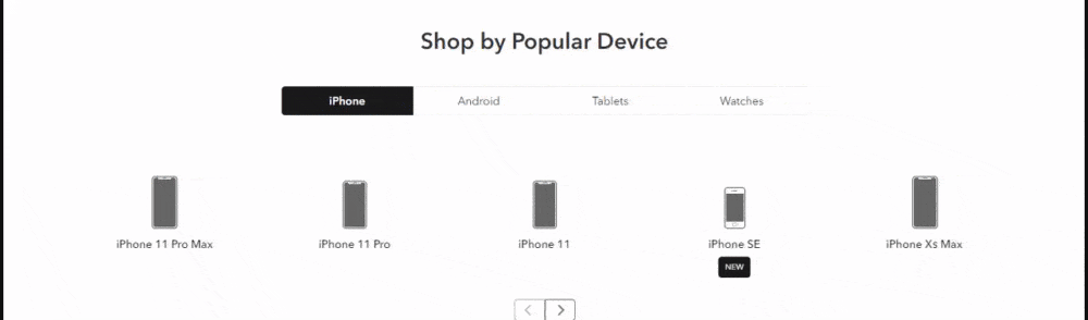
You can use this as an inspiration for how to organize your products and make it easy for your audience to find what they need.
24.Lovepop
Lovepop is another one of the examples of ecommerce websites that utilize visuals effectively.
The card company opts for an unsophisticated web design that enables their colored products to pop off the page. Lovepop also has well-designed navigation that organizes their cards by holidays or occasions.

This site also uses bright and colorful photos to highlight their different product categories.
Another great feature you can take inspiration from is how Lovepop showcases their products. To showcase how their cards work, they include a moving graphic for all of their products. Talk about holding a user’s attention!
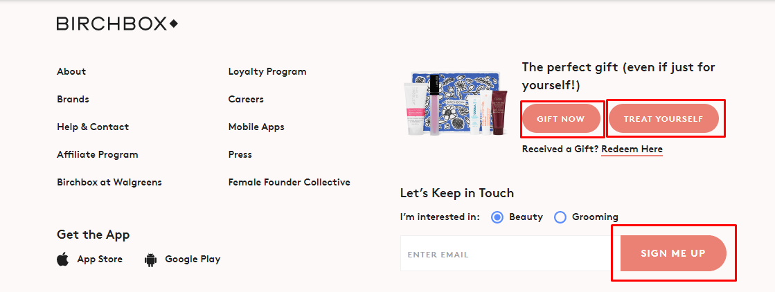
25.Birchbox
电子商务网页设计的另一个很好的例子是Birchbox. This beauty box company utilizes a chic design to showcase their products.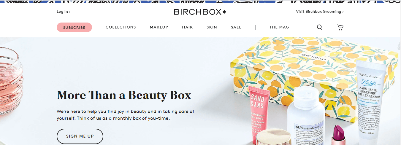
One of the great features on Birchbox’s site is their process explanation. They provide a visually enticing, step-by-step process for getting a Birchbox. This design element is very user-friendly and helps their audience understand their business better.

像许多不her sites, Birchbox utilizes CTAs that stand out on the page and catch the user’s attention. The peach-colored CTAs pop off the black and white design to attract the user’s eye and get them to take the next step towards buying a product.
26.Lego
Another example of a great ecommerce web design is Lego. With this example, let’s focus on Lego’s navigation.

Lego does a fantastic job of integrating their brand’s colors into the navigation. The bright yellow color stands out on the page and helps users spot the navigation bar easily. They also add a fun moving graphic with their logo that makes it visually attractive for their audience.

Additionally, Lego organizes their products using categories like “Themes” and “Shop By” to make it easy for shoppers to find products based on type, age, and interests. It provides a seamless shopping experience that enables their shoppers to efficiently find products.
27.Rebecca Atwood
The last website on our list of ecommerce website examples is Rebecca Atwood. This ecommerce store utilizes an elegant design that gives their website a homey feeling, which helps them highlight their home goods.
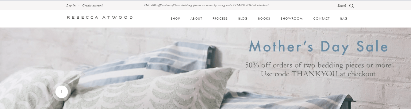
One of the unique features on this site is that they have a featured image on the homepage with their products. In this image, there are numbers over different products. When you highlight the number, you’ll get a pop-up box for the product and the ability to shop for it.

You can use this feature as inspiration for your site to help you create a more interactive web design that will keep leads engaged on your page.
5 Common characteristics of these great website examples
Now that we’ve shared all of our favorite ecommerce website examples, we want to outline some common characteristics among them. Here are fivecommon characteristics of a good website designthat you’ll want to include in your site.
1. Clean, visually appealing design
The first characteristic that all our examples of ecommerce websites share is that they have a clean and visually appealing design. Your website is often the first impression your audience gets of your business and if you want to make it a positive one, you need to have site that is aesthetically pleasing.
An outdated or uninviting website can quickly drive leads away from your site.
Additionally, every site on our list integrates their brand’s style into the website. They use color and style choices that reflect their brand to help them build brand awareness.
2. Easy-to-use navigation
The second feature you’ll notice with these ecommerce website design examples is they all have an easy-to-use navigation. When users visit your site, they want to find products quickly and easily, and if your navigation isn’t organized, you could deter people from your site.
用户可以访问任何一个我们所提到的网站and easily and find the products they need. If you want to build the best web design for your company, you’ll want to create organized navigation that allow users to find and purchase the products they’re interested in quickly.
3. High-quality visuals
Visualsare a critical component of your website design. As you can see by the ecommerce site examples, they all utilize high-quality visuals to engage their audience. From photos tovideostomotion graphics, you need stunning visuals to draw your audience into your site.
These visuals should be of your products, people using your products, and more. By adding these visuals, you’ll create a better web design for your company.
4. Skimmable pages
Another feature of these ecommerce website examples is that their pages are easily skimmable. When someone visits the above sites, they can quickly scroll through the page to find relevant information. They use visuals to help break up text into smaller chunks that are easier to digest.
When you design your site, you want to ensure that you balance text and visuals. This balance will keep users from feeling trapped and keep them on your site pages for longer.
5. Focused on user experience
Lastly, all these ecommerce website design examplesfocus on the user experience. These sites focus on building an intuitive site that caters to their audience and makes it easy for them to shop on their site.
If you want to have auser-friendly site, you need to focus on integrating elements that make it easier for your audience to browse on your site. From organized navigation to interactive elements, you can add elements that will keep your audience engaged on your site.
Partner with a team of ecommerce masters!
WebFX campaigns have delivered more than12,936,451ecommerce transactions in the last 5 years
Read the Case Studies
Build your dream ecommerce website today
You’ve looked at tons of ecommerce website examples, so you’re feeling inspired to design your ecommerce site. But where do you start? And how do you build your site?
If you don’t know how to get started WebFX, is here to help. We have anaward-winning teamof web designers that can help you build the website of your dreams.
Don’t wait any longer to build your dream website!Contact us onlineor call us today at888-601-5359to speak with a strategist about building your business’secommerce website!